UX/UI Modernization of a Complex Enterprise System
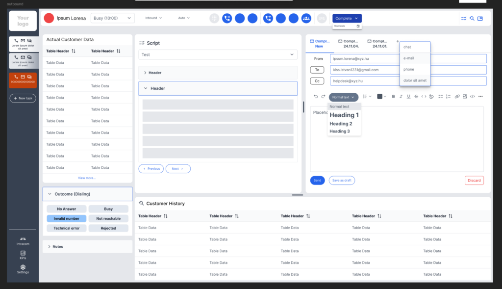
I worked on a complete UX/UI redesign of a contact center application that had been in use for several years.
The existing system was functionally robust, but its visual design, usability, and overall user experience no longer met modern enterprise expectations.
The goal was not simply to refresh the interface, but also to rethink the system logic, information architecture, and agent workflows.
The Challenge
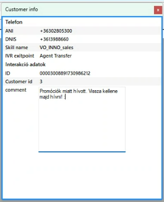
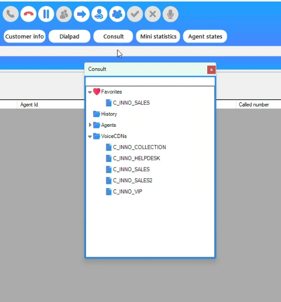
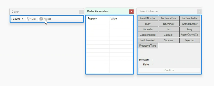
The legacy system supported a wide range of complex contact center functions, but over the years, the interface had become increasingly difficult to navigate.
Key challenges:
- managing large amounts of data and functionality on a single screen
- simplifying complex agent workflows
- supporting fast decision-making
- integrating new communication channels
- creating a modern visual experience that could meet current market expectations
During the design process, we explored how to preserve the system’s existing capabilities while making everyday use faster and more intuitive.
UX Process
Mapping User and Business Needs
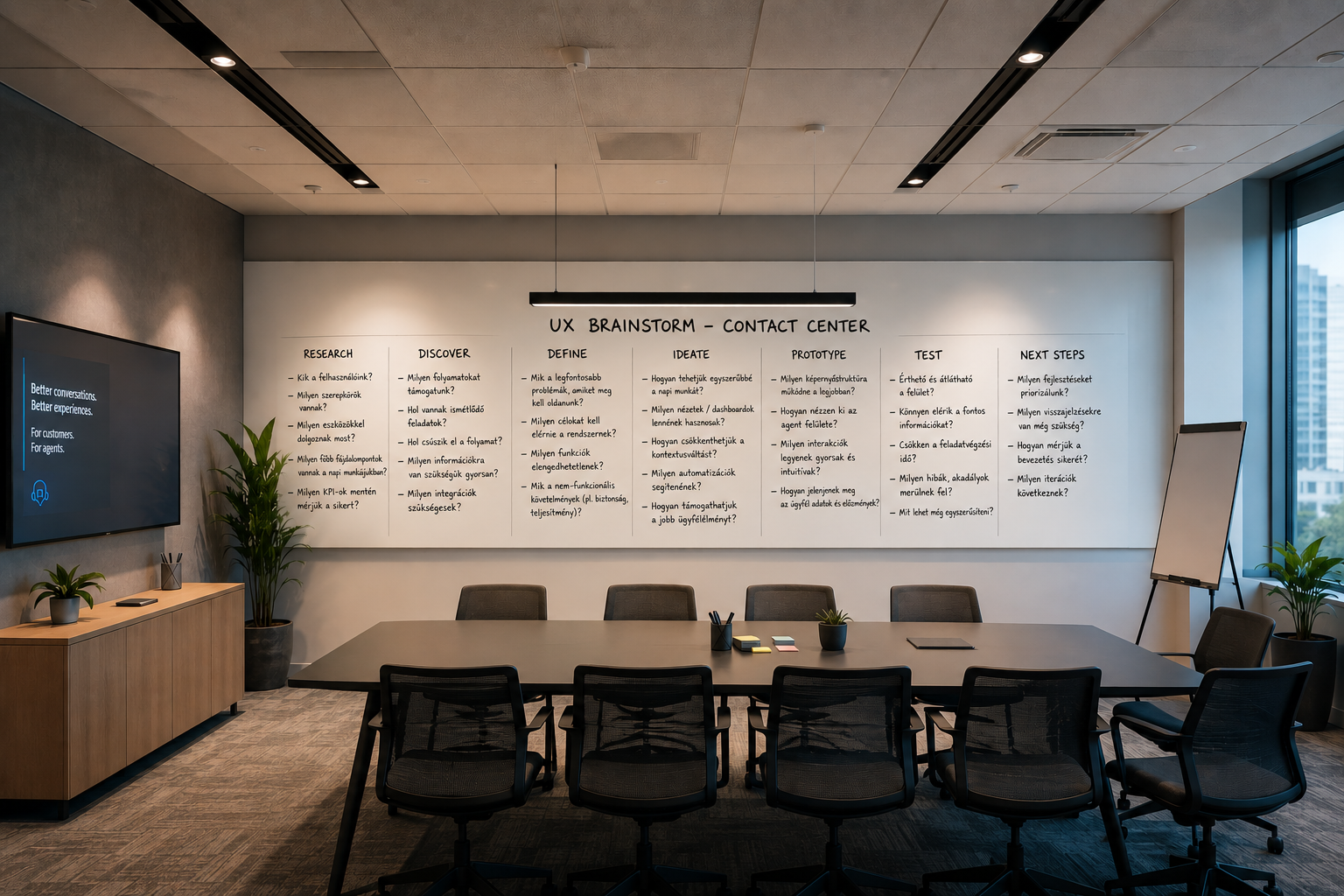
At the beginning of the project, I used workshops to understand how the contact center operated, what the business needed, and which technological constraints had to be considered.
I worked closely with multiple stakeholders throughout the design process:
- business experts
- developers
- architects
- product-side decision-makers
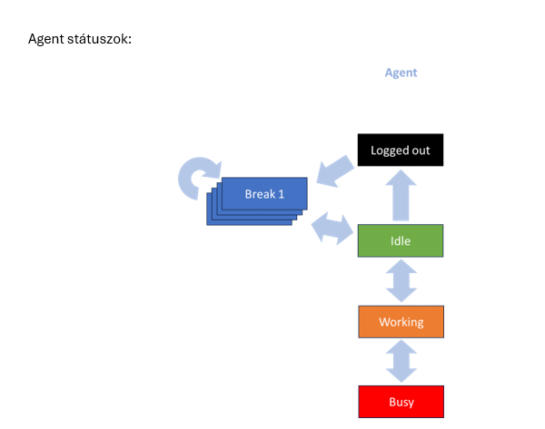
Key questions:
- What information needs to be available at all times?
- What tasks do agents perform on a daily basis?
- Where can workflows be simplified?
- How can we reduce the risk of errors?
Redesigning the Information Architecture
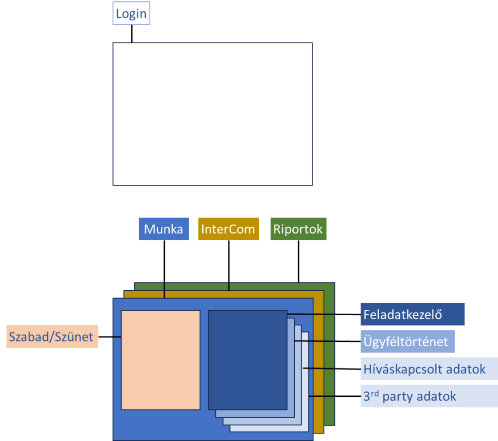
One of the most important tasks was restructuring the system.
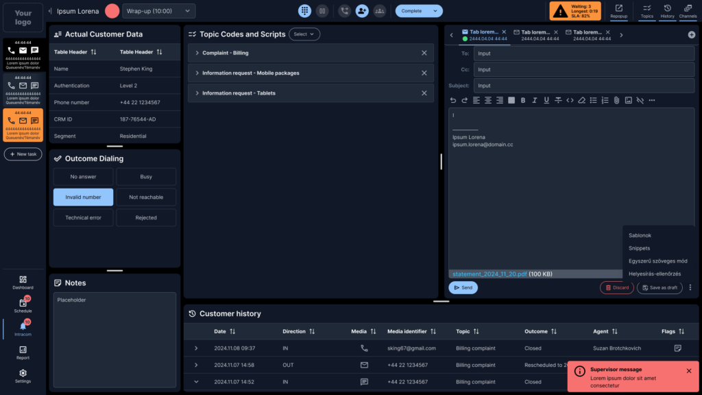
Instead of separate windows and disconnected functions, we designed an integrated workspace.
Key elements included:
- persistent status controls
- call controls
- customer data panel
- script management
- notes
- interaction history
- KPI data
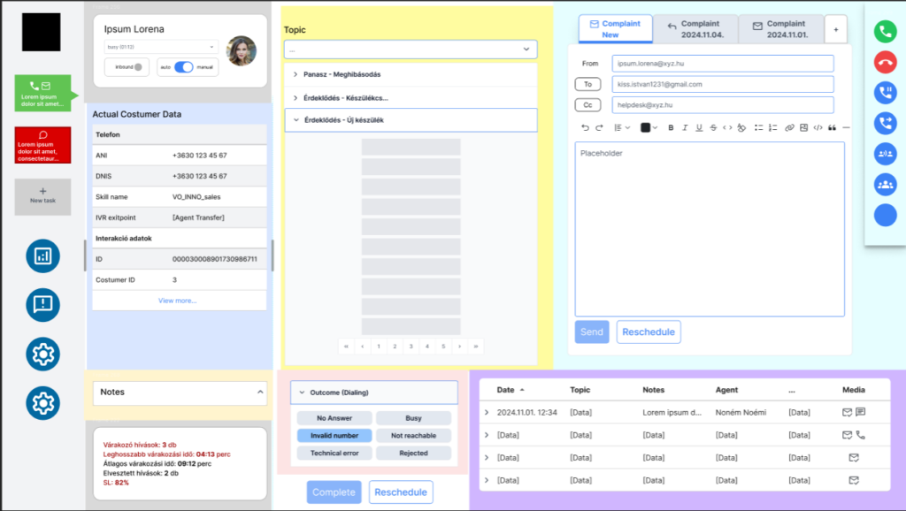
The goal was to ensure that agents always had the information they needed for the current workflow in view, while keeping frequently used functions easily accessible.
Design Foundation
PrimeNG Design System (Community) + Lara Theme
Components and states designed:
- button variants
- active and inactive states
- hover states
- status icons
- alerts
- tables
- cards
- navigation elements
The goal was to create a reusable component system that would be easy to implement.
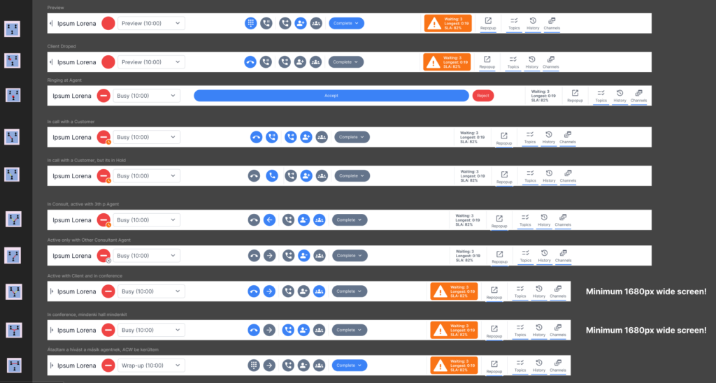
Fluid desktop layout
The system was designed primarily for desktop use, but it needed to support a range of monitor resolutions.
Rather than using a traditional mobile-first responsive approach, we designed a fluid desktop layout.
Goals:
- support screen widths from 1360 to 1920 px
- flexible panels
- resizable areas
- maintain a stable working environment
The aim was not to rearrange interface elements across screen sizes, but to ensure that the complex agent workspace remained efficient and usable on different monitors.
Light & Dark Theme
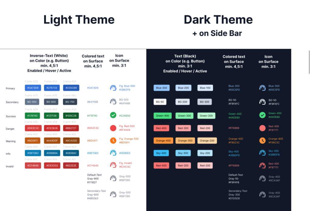
We designed both light and dark themes for the system. When defining the color system, I considered:
- contrast ratios
- readability during extended periods of use
- clear recognition of status colors
- consistent visual feedback
The interface needed to remain clear and usable during several hours of daily use by contact center agents.
Accessibility
I also took WCAG 2.1 guidelines into account throughout the design process.
Areas considered:
- color contrast
- recognizability of icons
- clear indication of different states
- appropriate sizing of interactive elements
- focus states and feedback
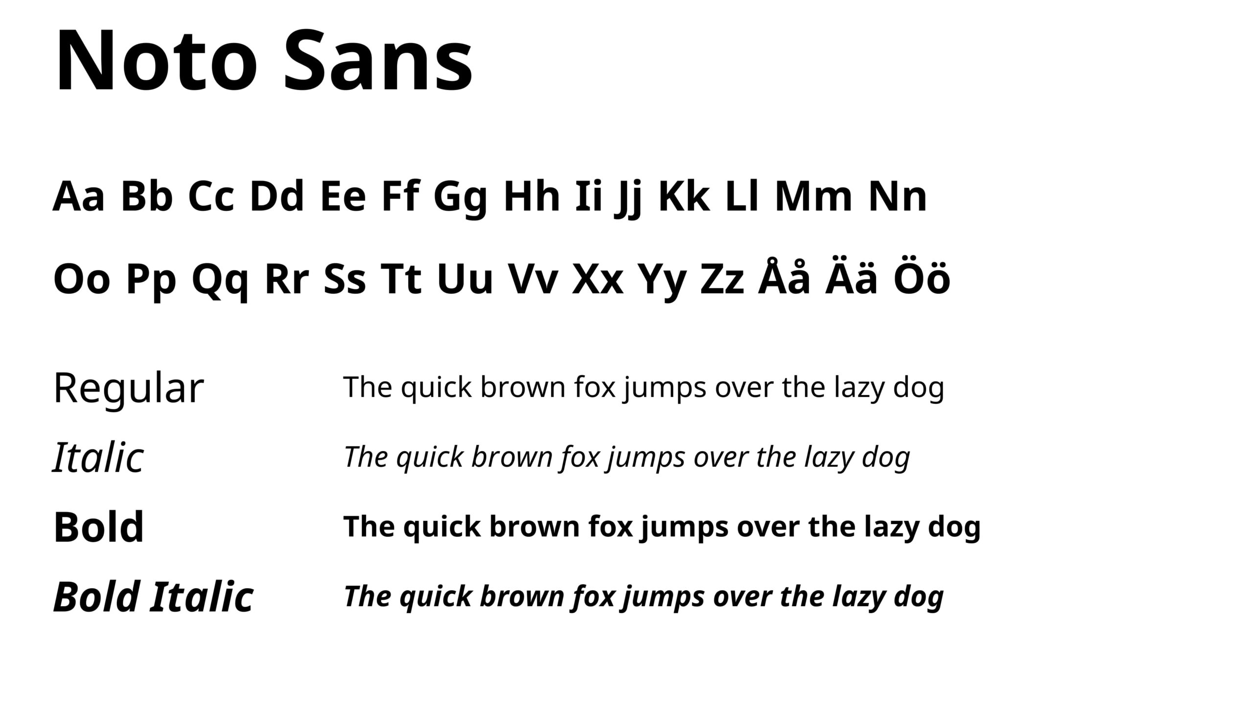
- readable typography (Typeface: Noto Sans (Google Fonts))
The Outcome
The redesign aimed to create a modern contact center platform that could support both efficient agent workflows and the developers working on the system over the long term.
Built on a consistent component system, the new interface made complex workflows easier to understand and faster to use. It also became easier for new users to learn, while remaining flexible, extensible, and customizable.